Discussion:
[fontforge-users] Width of accented glyph is locked (tonos on capitals)
marty39
2015-11-29 00:27:34 UTC
Permalink
I'm building a set of fonts (not exactly a family), inspired by thirteen
capital letters on a signboard, that has developed into capitals, lower case
and small caps for basic LGC.

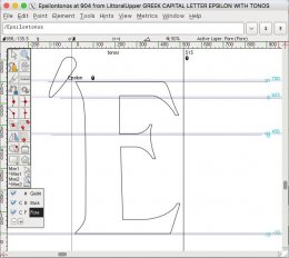
Along the way I discovered that although Fontforge places the Greek tonos
accent above both capitals and lower case, the tonos really belongs to the
left of a capital, not above it. Moving the diacritic from above a capital
vowel to the left of it (except on 'A') places it to the left of the origin,
requiring that the advance width be increased. See attached image.

I want the composite glyph to consist of references and not independent
contours. But as long as the accented glyph is made up of references, the
advance width shows a lock icon in glyph view, and nothing I do will change
the side bearings or the advance width. Is there any way (without detaching
the references) to make the side bearings fit the whole glyph and not just
the letter reference?

<Loading Image...>


--
View this message in context: http://fontforge.10959.n7.nabble.com/Width-of-accented-glyph-is-locked-tonos-on-capitals-tp14936.html
Sent from the User mailing list archive at Nabble.com.

------------------------------------------------------------------------------
marty39
2015-11-29 03:17:56 UTC
Permalink
Found one way. Go to where the letter component is defined by splines and
copy reference. Delete the letter reference from the composite glyph and
paste in the reference you just copied. The glyph looks exactly the same
except that the advance width is not locked, and all metrics menu commands
are now accessible.

Has to be done step by step in glyph view for each glyph. Is there a batch
method?


--
View this message in context: http://fontforge.10959.n7.nabble.com/Width-of-accented-glyph-is-locked-tonos-on-capitals-tp14936p14937.html
Sent from the User mailing list archive at Nabble.com.

------------------------------------------------------------------------------
Nathan Willis
2015-11-29 15:41:49 UTC
Permalink
Post by marty39
Found one way. Go to where the letter component is defined by splines and
copy reference. Delete the letter reference from the composite glyph and
paste in the reference you just copied. The glyph looks exactly the same
except that the advance width is not locked, and all metrics menu commands
are now accessible.
Has to be done step by step in glyph view for each glyph. Is there a batch
method?
Yeah, Ff has some deeply buried quirks in accented glyph management; I've
been there, too....

How did you create the composite glyph initially? Was it with "Build
Accented" or "Build Composite" from the menu?

Also, I'm assuming you weren't using anchors to position the accents, is
that right?

Nate
Post by marty39
--
http://fontforge.10959.n7.nabble.com/Width-of-accented-glyph-is-locked-tonos-on-capitals-tp14936p14937.html
Post by marty39
Sent from the User mailing list archive at Nabble.com.
marty39
2015-11-29 16:38:55 UTC
Permalink
On Nov 28, 2015 10:01 PM, "marty39" &lt;
....
How did you create the composite glyph initially? Was it with "Build
Accented" or "Build Composite" from the menu?
Also, I'm assuming you weren't using anchors to position the accents, is
that right?
Nate
For what it's worth, I used "Build Accented" and did not use anchors. If I
had to use anchors I wouldn't have built the glyphs. As I said, this was all
inspired by thirteen capitals.

Between posting that question and finding the workaround, I wondered why I
needed those glyphs at all. Anybody wanting to insert Epsilon-tonos could
simply type a tonos followed by an Epsilon, since the tonos is a spacing
character. The composite characters for lower case plus tonos are needed
because there is no combining tonos ... am I right?

I apologize for mis-writing. The tonos does not go on 'A', it goes on Alpha.
And it can be placed not only on the Alpha but also on the Omicron and Omega
without encroaching on the left side bearing. Only the Epsilon, Eta, Iota
and Upsilon needed the fix.

No, I don't know Greek. All I know is the alphabet and a few tourist
phrases.


--
View this message in context: http://fontforge.10959.n7.nabble.com/Width-of-accented-glyph-is-locked-tonos-on-capitals-tp14936p14939.html
Sent from the User mailing list archive at Nabble.com.

------------------------------------------------------------------------------
Nathan Willis
2015-11-29 18:08:55 UTC
Permalink
Post by marty39
On Nov 28, 2015 10:01 PM, "marty39" &lt;
....
How did you create the composite glyph initially? Was it with "Build
Accented" or "Build Composite" from the menu?
Also, I'm assuming you weren't using anchors to position the accents, is
that right?
Nate
For what it's worth, I used "Build Accented" and did not use anchors. If I
had to use anchors I wouldn't have built the glyphs. As I said, this was all
inspired by thirteen capitals.
Well, the "Build" commands take anchors into account. If you have the bases
and marks set up with anchors, the Builds create the precomposed glyphs
from them. If you don't have anchors, Build* "guesses" where the diacritics
go. Not always well. (Alternatively, if you set up anchors and don't do
Build*, you'll have well-placed uncomposed glyphs, but no precomposed ones.
Which might be fine for your font, of course.)

But the real reason I asked was that the Accented and Composite flavors of
Build* don't always do the same thing. I've had fewer annoyances with
Composite.
Post by marty39
Between posting that question and finding the workaround, I wondered why I
needed those glyphs at all. Anybody wanting to insert Epsilon-tonos could
simply type a tonos followed by an Epsilon,
They could if they're typing (and knew what glyphs are available); that
wouldn't help if they opened an existing document, though.
Post by marty39
since the tonos is a spacing
character. The composite characters for lower case plus tonos are needed
because there is no combining tonos ... am I right?
I think that's U+0344:
http://www.fileformat.info/info/unicode/char/0344/index.htm

But I'd certainly defer to someone who knows Greek.
Post by marty39
I apologize for mis-writing. The tonos does not go on 'A', it goes on Alpha.
And it can be placed not only on the Alpha but also on the Omicron and Omega
without encroaching on the left side bearing. Only the Epsilon, Eta, Iota
and Upsilon needed the fix.
No, I don't know Greek. All I know is the alphabet and a few tourist
phrases.
Yeah, it's not easy to tackle a non-native script; a lot of people try to
discourage designers from doing it. Personally, I'd say don't worry too
much about it but try to find a native designer who can give you feedback.

In the meantime, I think I have encountered the same issue you're
describing, from when I made i and j in their dotless forms first, then
created the dotted forms as composites. It'd be worth filing a bug about,
IMO.

Is your font online where we could see it?

Nate
Post by marty39
--
http://fontforge.10959.n7.nabble.com/Width-of-accented-glyph-is-locked-tonos-on-capitals-tp14936p14939.html
Post by marty39
Sent from the User mailing list archive at Nabble.com.
marty39
2015-11-30 02:58:24 UTC
Permalink
Post by Nathan Willis
...
... Anybody wanting to insert Epsilon-tonos could
simply type a tonos followed by an Epsilon,
They could if they're typing (and knew what glyphs are available); that
wouldn't help if they opened an existing document, though.
since the tonos is a spacing
character. The composite characters for lower case plus tonos are needed
because there is no combining tonos ... am I right?
http://www.fileformat.info/info/unicode/char/0344/index.htm
...
Is your font online where we could see it?
1) Existing documents are frequently messed up. Even when reading an Apple
webpage on an Apple machine with Apple software, accented letters can come
out as notdef.

2) I already looked at U_0344. It's dialytica tonos, a combination of
diaeresis with tonos. Not with acute accent as it says on that page. Tonos
is more steeply angled, like prime.

3) No, it's not on line yet. I'm rethinking the Greek lower case yet again.

What would be a good place to put a font with nonstandard styles? Maybe as a
"work in progress"? I'm building three styles: (1) "Signboard," meant for
closely spaced lines with the diacritics accommodated by squeezing the
letters, not by encroaching on the leading; (2) "Upper," with small caps
instead of lower case, and lining numerals; (3) "Lower," with true lower
case and old style proportional numerals. Upper and Lower could be used
together, but not with Signboard.


--
View this message in context: http://fontforge.10959.n7.nabble.com/Width-of-accented-glyph-is-locked-tonos-on-capitals-tp14936p14941.html
Sent from the User mailing list archive at Nabble.com.

Loading...